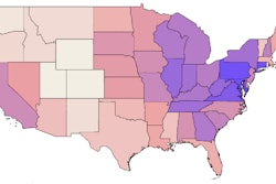


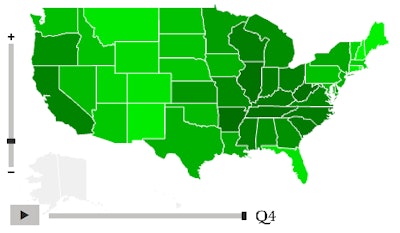
Created using the OpenHeatMap.com open-source online mapping software, the maps below illustrate flatbed, dry van and refrigerated van average paid rates, tracked by Truckstop.com (formerly Internet Truckstop) through year 2014.
States shaded with darker colors showed on average stronger rates on outbound spot-market freight than those shaded more lightly. Each map shows historical rate averages by quarter. Users can explore quarterly variation using the slider just under the map. The “outbound rate paid per mile” color key along the bottom of each embedded map offers a quick-glance median rate, computed among states within bottom, middle and top ranges.
For a list of the overall highest- and lowest-rate states for 2014, access lists in the Rates Hall of Fame story and this linked Rates Hall of Shame examination.